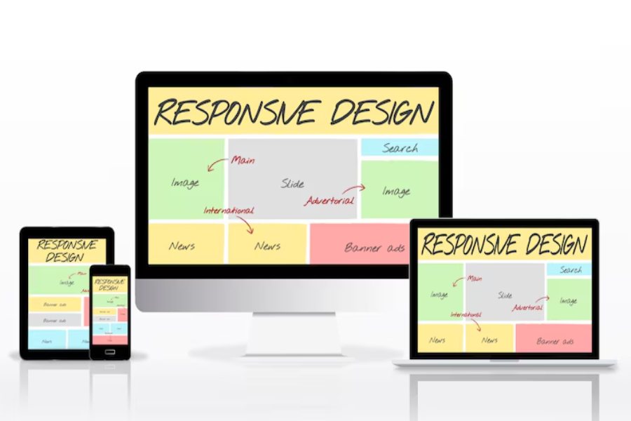
The internet is no longer bound to desktops. Smartphones, tablets, smart TVs, and even watches are windows into the web. That shift is exactly why responsive web design is essential. Websites that don’t adjust to different devices feel clunky, frustrate users, and drive them away. In contrast, a responsive site fluidly adapts, ensuring every visitor sees your content in its best form.
Search engines recognize this too. Google rewards mobile-friendly design, meaning responsiveness directly affects SEO rankings. If your website isn’t built responsively, you’re not just losing users — you’re losing search visibility and revenue opportunities.
In today’s digital economy, visitors expect seamless browsing. Whether they’re checking your store on a phone at lunch or researching services on a tablet at home, they want speed, clarity, and consistency. That is why responsive web design is essential — it merges design with functionality to future-proof your brand.
This article explores the critical role of responsiveness from multiple angles. We’ll break down how it impacts SEO, user trust, accessibility, conversions, and even your bottom line. Through structured outlines, detailed sections, and clear explanations, you’ll understand precisely why responsive web design is essential — and why you can’t afford to ignore it.
Why Responsive Web Design is Important?
Why Responsive Web Design is Important: because it ensures your site looks and works perfectly on any device, improving user experience, boosting SEO rankings, and increasing conversions. A responsive design adapts seamlessly to different screens, builds trust with visitors, and supports long-term business growth by aligning with how people browse the web today.
Digital Growth Simplified Why Responsive Web Design Is Important
Responsive web design has become the foundation of digital success. In today’s mobile-first world, businesses cannot rely on static layouts that frustrate users. More than half of global traffic now comes from mobile devices, and if visitors struggle to view or navigate a site, they quickly leave. A responsive design ensures that every user, whether on a phone, tablet, or desktop, enjoys equal access and a consistent experience.
Search engines also reward responsiveness. Google prioritizes mobile-friendly sites because they align with user behavior, meaning non-responsive websites face higher bounce rates and lower rankings. A site that adapts seamlessly across devices not only boosts SEO but also conveys professionalism and relevance, two key signals of credibility.
User trust is equally critical. Shoppers abandon sites that require awkward pinch-zooming, but a smooth interface encourages them to explore and convert. Consistent design across platforms also strengthens brand identity, showing attention to detail and commitment to accessibility. Tools such as Scientific Calculator Online demonstrate how seamless design can directly improve usability and trust.
In the end, responsive web design is not a luxury—it’s a business necessity. Without it, companies risk being invisible in search, alienating customers, and losing revenue.
How Responsive Web Design Impacts SEO and Rankings?
Google has made it clear: mobile-friendly websites rank higher. With mobile-first indexing, Google evaluates the mobile version of your site before the desktop version. If your site isn’t responsive, you’re automatically at a disadvantage. That’s why responsive web design is essential — it ensures your content looks clean, accessible, and competitive in search results.
How Site Speed Ties Into Responsive Web Design
Speed is a critical SEO factor. Responsive layouts use flexible grids, optimized media, and streamlined code to load quickly on any device. A fast-loading site reduces frustration and encourages visitors to stay engaged. When users spend more time on your site, Google interprets it as valuable and rewards you with better rankings.
Why Bounce Rates Reveal Why Responsive Web Design is Important
High bounce rates are a nightmare for SEO. Non-responsive designs force users to pinch, zoom, and scroll in an awkward manner. Frustrated visitors leave within seconds, signaling to search engines that your site isn’t user-friendly. A responsive site keeps users comfortable, lowering bounce rates and improving your SEO health.
If you’re planning to invest in responsive web design for your business, a Website Design Cost Calculator can help you estimate the costs of building a mobile-friendly and SEO-optimized site that ensures a seamless user experience across all devices.
When Mobile Usability Becomes a Ranking Factor
Mobile usability isn’t optional anymore. With mobile-first indexing in full swing, responsiveness directly determines visibility. A site that adapts smoothly to every screen size not only delights users but also secures a stronger place in search rankings.
Essential Benefits of Responsive Web Design
A single well-executed responsive design unlocks numerous advantages. Here’s why responsive web design is important for businesses and users alike:
- Consistent Experience Across Devices: Users see the same quality of design whether on a phone or a laptop.
- Improved SEO Performance: Google rewards responsive designs with better search rankings.
- Higher Conversion Rates: Smooth navigation encourages visitors to act, from sign-ups to purchases.
- Cost-Effective Maintenance: A single responsive site eliminates the need for multiple versions.
- Future-Proofing for New Devices: As screen sizes evolve, responsive frameworks adapt automatically.
- Accessibility and Inclusivity: A responsive site works better with assistive technologies, broadening reach.
Why Responsive Web Design is Important for User Trust and Conversions?
Trust online is earned in seconds, and poor design can shatter it just as quickly. When a website looks clunky or fails to adapt to different devices, visitors begin to doubt the brand’s professionalism and reliability. Responsive design removes that barrier. It creates a seamless flow where images resize smoothly, text remains legible, and buttons are easy to tap on any screen. This friction-free experience reassures users that their time and attention are valued, and that confidence translates directly into conversions.
For e-commerce platforms, the stakes are even higher. Mobile shoppers now dominate the online marketplace, and they demand smooth, intuitive navigation. A non-responsive site leads to abandoned carts and missed sales opportunities. By contrast, a responsive checkout process is faster, cleaner, and easier to complete, significantly reducing drop-offs. That is why responsive web design is essential — it doesn’t just improve the look of a site, it safeguards revenue and strengthens customer loyalty.
Accessibility is another crucial dimension. A responsive website adapts not only to screen sizes but also to different user needs, including those who rely on assistive technologies. This inclusivity fosters trust by demonstrating that your brand values and accommodates all visitors. In a digital world where reputation defines success, responsiveness signals that your business is modern, considerate, and ready to meet customer expectations head-on.
When to Prioritize Responsive Web Design in Strategy?
Prioritizing responsiveness isn’t just about design—it’s about strategy. It positions your brand for long-term success in an increasingly mobile-first digital landscape.
If Your Site Looks Outdated, Upgrade Immediately
First impressions online matter. An outdated site design signals neglect and can instantly push users away. If your website still relies on rigid layouts or doesn’t adapt to different screens, a responsive redesign should be the top priority. Modern audiences expect flexibility, and ignoring this expectation damages credibility as well as search engine visibility.
How Startups Benefit from Responsive Web Design
For startups, a responsive website is more than a design choice — it’s a trust-building tool. Launching with a mobile-friendly site shows professionalism, gives an edge over less-prepared competitors, and communicates that the business is serious about growth. Startups that invest early in responsiveness often save money later by avoiding costly redesigns.
Why Responsive Web Design is Important in Content Marketing
Great content loses value if it can’t be consumed easily. Blog posts, infographics, and videos need to adapt fluidly to small screens where most users consume media today. Responsive layouts ensure smooth reading and clear visuals, boosting engagement and increasing the likelihood that content will be shared.
When Analytics Reveal Poor Mobile Metrics
Numbers don’t lie. If analytics show high bounce rates, low session durations, or declining conversions on mobile, it’s a strong signal that your site isn’t keeping up. A responsive redesign addresses these problems directly, improving usability and restoring performance.
Conclusion
Responsive design has shifted from a design trend to a business imperative. This article has shown why responsive web design is essential — for SEO, user trust, conversions, and long-term growth. Companies that ignore responsiveness risk alienating half their potential audience, while competitors embrace the mobile-first era.
The lesson is clear: responsive web design is essential not just for aesthetics but for strategy. It connects your content to users seamlessly, strengthens your digital presence, and prepares your brand for an evolving technological landscape.
FAQ’s
Why is responsive web design is important for SEO?
Because Google prioritizes mobile-friendly websites in its ranking system, a responsive design directly improves search visibility, reduces bounce rates, and drives organic traffic growth.
How does responsive design improve user experience?
It automatically adapts layouts to fit any screen size, eliminating the frustration of pinching or scrolling awkwardly, which encourages users to stay longer and engage more deeply with content.
Why is responsive web design is important for small businesses?
It offers cost-effective maintenance since one site works across all devices, while also improving SEO performance and building stronger trust with customers who expect seamless browsing.
Does responsive design affect website conversions?
Yes. A smooth, intuitive interface paired with mobile-friendly navigation and checkout processes makes it easier for customers to complete purchases, significantly boosting overall conversion rates.
Why is responsive web design is essential for future devices?
It ensures websites remain adaptable to emerging screen sizes, browsers, and technologies, providing long-term flexibility as new digital devices and platforms continue to evolve.